BUILT4CLIMATE

Urban Heat Island Map – Campus as a living lab

This project utilizes the Notre Dame Campus as a living lab to map the heat island effect by bridging innovation in sensor technology, field auditing, spatial analytics, machine-learning model, data visualization and youth climate action to better understand the relationship between built environment conditions, urban microclimates, ecosystems, and heat stress.
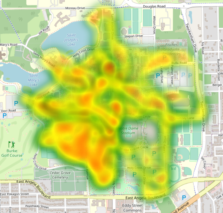
Heat map overlaid on a map of the University of Notre Dame campus, showing a concentration of activity centered around Notre Dame Stadium and extending north towards Saint Mary's and Saint Joseph's Lakes.
Hand holding a white rectangular device with four circular magnets and a QR code against the backdrop of Dunne Hall at the University of Notre Dame.
Infrared aerial view of a building on the University of Notre Dame campus. The building and surrounding landscape are depicted in varying shades of orange, yellow, and purple, indicating different temperature levels.

Urban Sustainability – Embodied Carbon of Cities

As operational carbon declines, embodied carbon is becoming a dominant climate concern, yet U.S. policies and data remain insufficient to address it. This project creates a multi-scale ecological-technological framework—BUILT4CLIMATE—to measure, map, and assess embodied carbon emissions across the U.S. building stock using BIM, LCA, and BSDM integration.

Chicago emissions data visualized as a pie chart and bar graph of the top 10 building archetypes.
Line graph showing projected annual CO2 emissions from 2020-2100. A rising black line represents the Baseline Scenario. A green and purple band represents the Progressive Scenario, declining from approximately 65 Gt CO2eq in 2020 to approximately 30 Gt CO2eq in 2100. A light blue band and dashed teal line represent the 1.5 degree target; a lavender band and short horizontal red line at 2050 represent the 2 degree target. CO2 reduction amounts for each target are also shown.
3D bar graph overlaid on a map showing environmental impact data. Dark blue and yellow bars of varying heights cluster in urban areas. A key identifies data categories including Acidification, Eutrophication, Particulate Matter, Ozone Depletion, GWP, Smog, and Total Primary Energy. A bar chart in the upper left corner details the Top 100 locations by Total Primary Energy. A control panel on the right allows for layer adjustments.